Branding
Neer
Objective
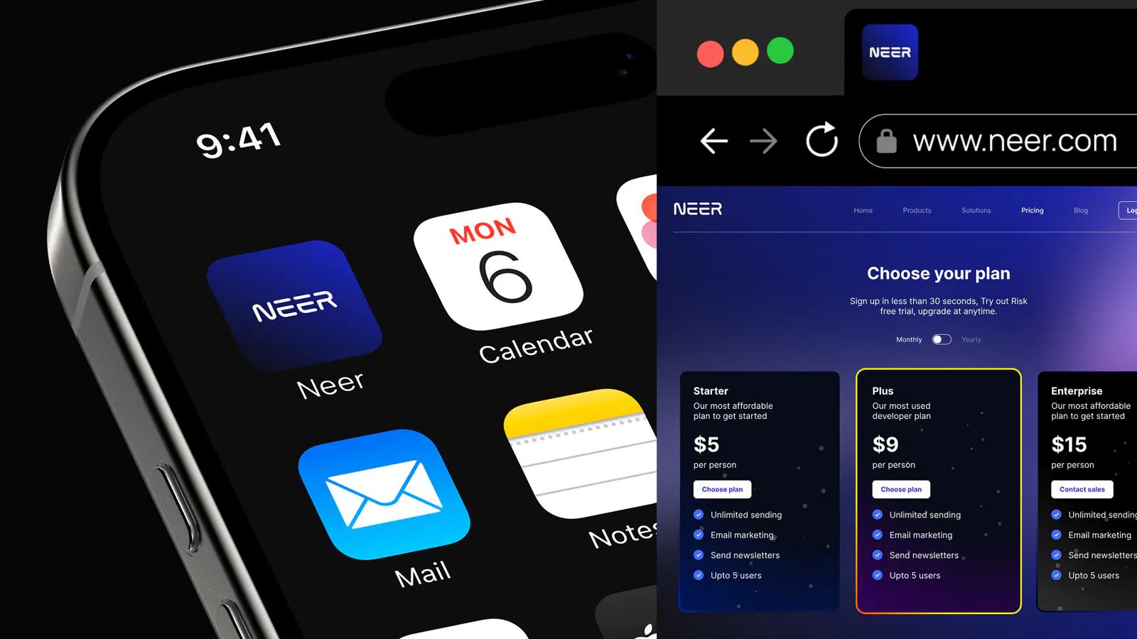
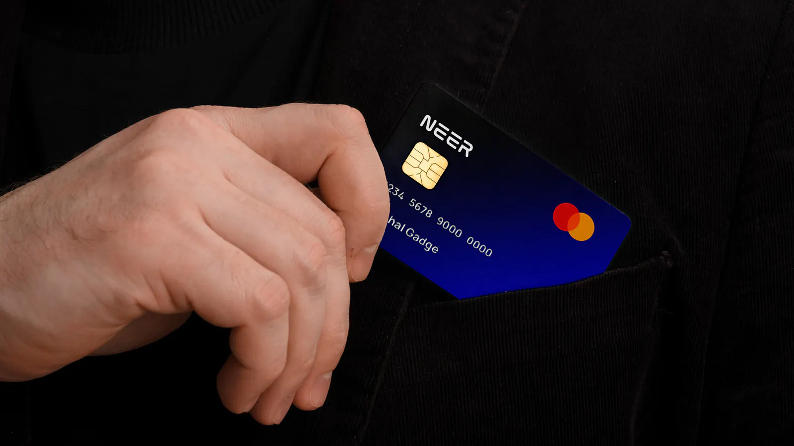
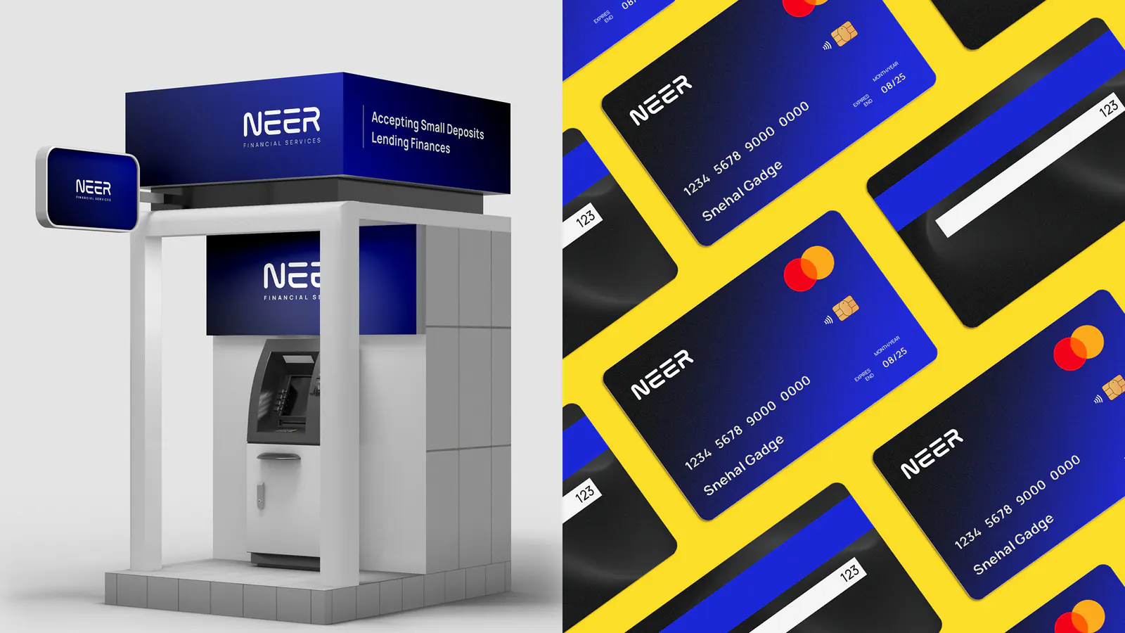
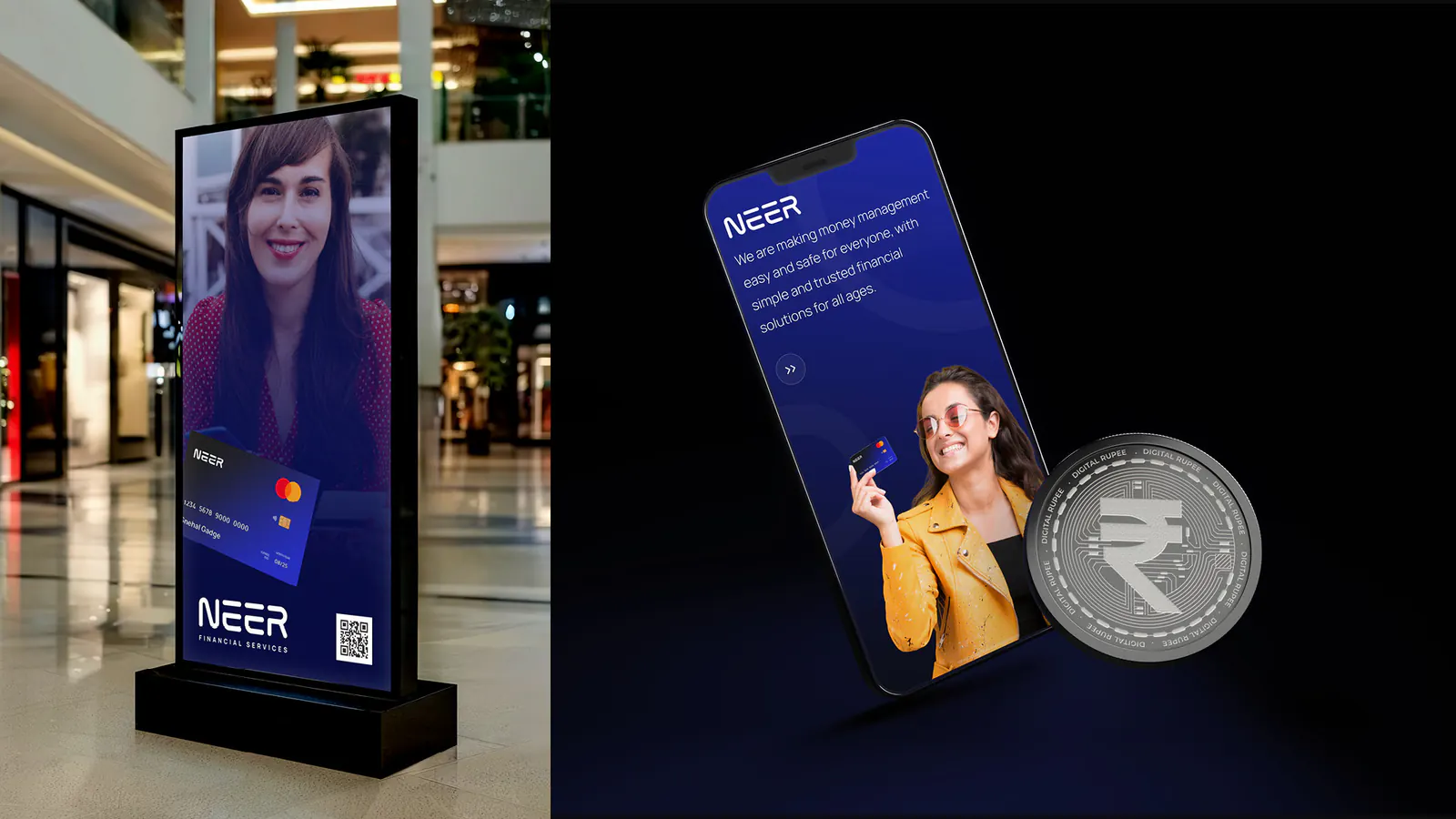
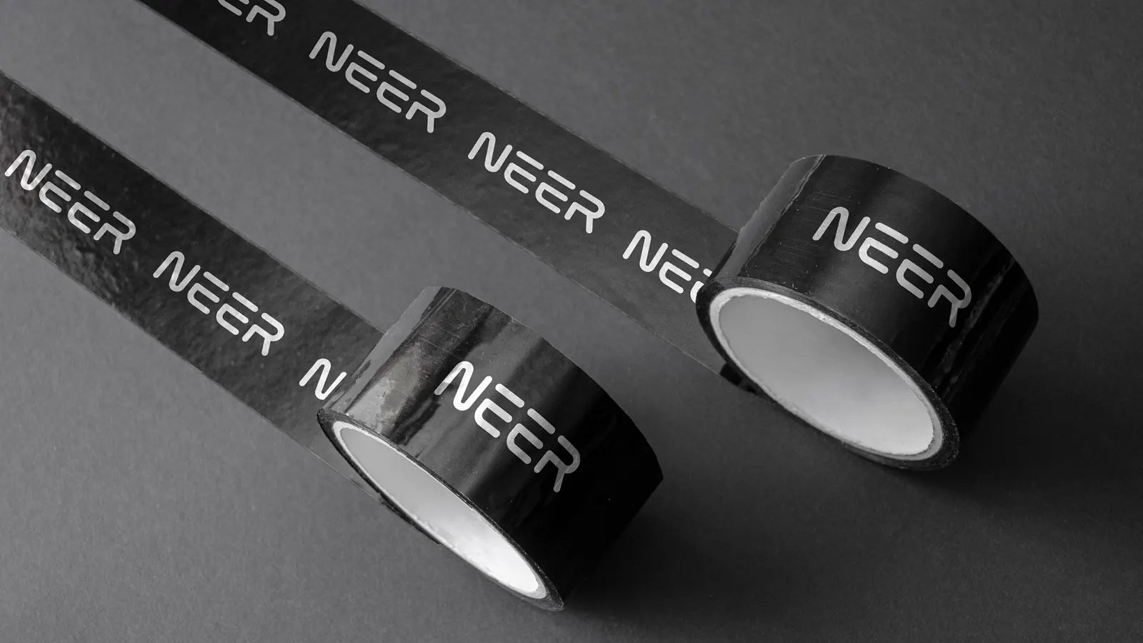
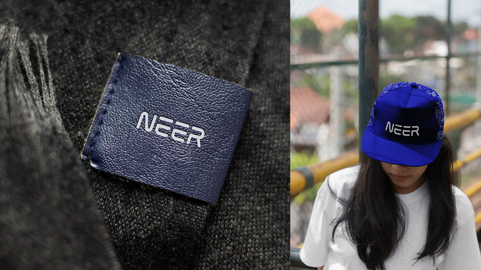
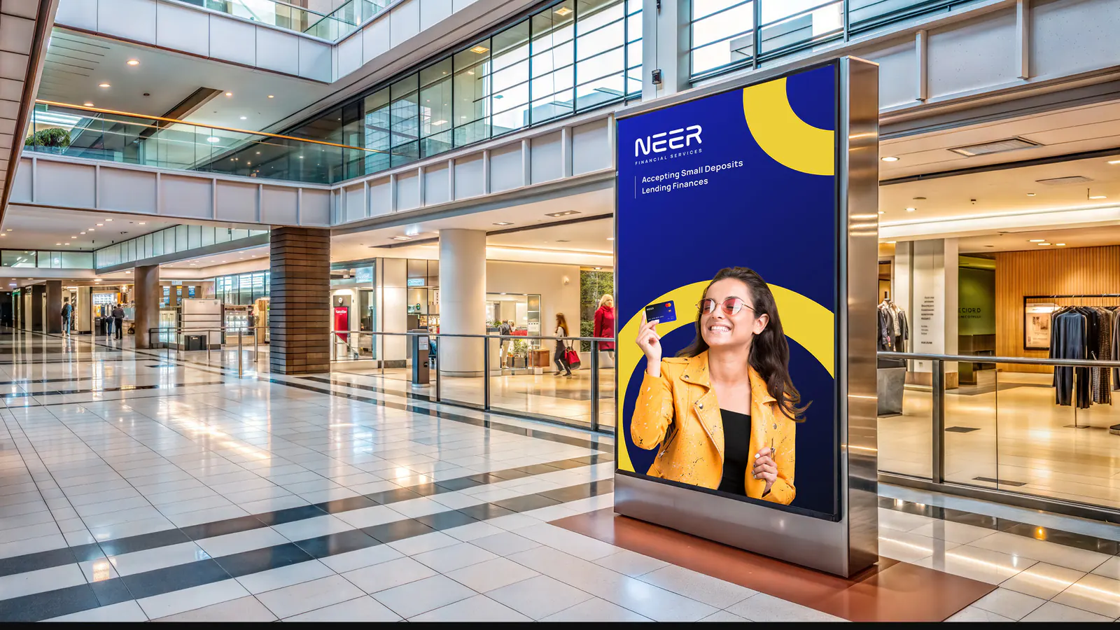
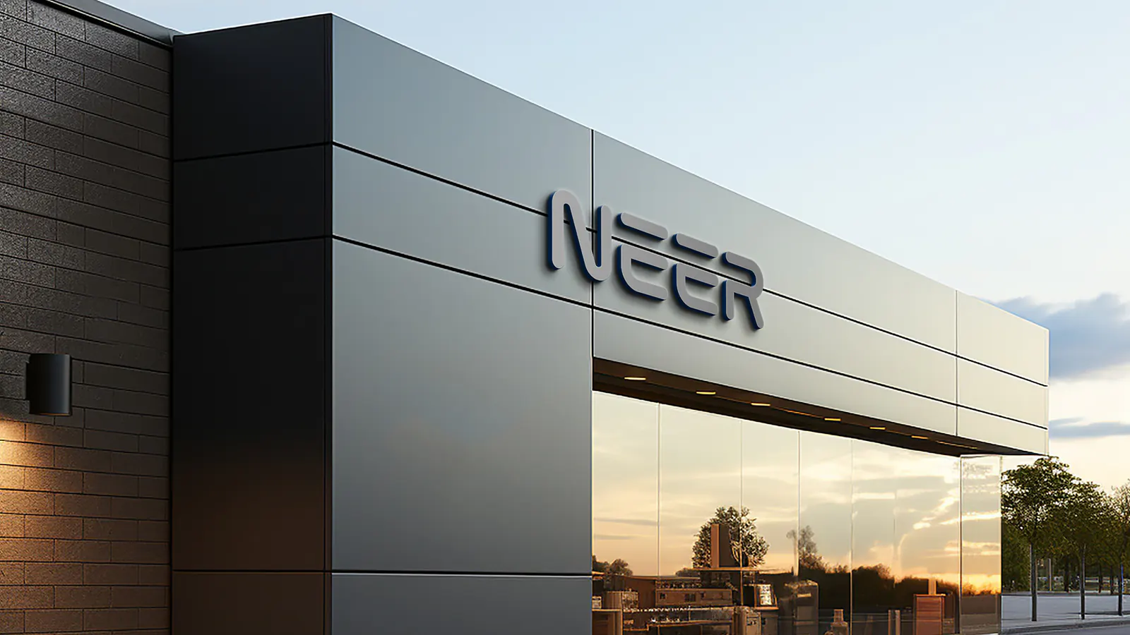
Neer is a fintech brand offering simple, secure financial solutions: accepting small deposits and providing lending services to people of every age group and income level. We created its brand identity, from a custom logo built on a precise grid to the colour palette, typography and brand applications, so Neer feels trustworthy, professional and approachable.
The Brand Brief
NEER is a fintech brand that offers simple and secure financial solutions to a wide range of users. The company focuses on accepting small deposits and providing lending services, aiming to serve people from all age groups and income levels. The goal is to build a brand that feels trustworthy, professional and approachable, helping users manage and access their finances with ease.
The brand identity should reflect NEER’s core values of financial trust, simplicity and accessibility. It must strike the right balance between being friendly and youthful, while maintaining a subtle classic tone that feels dependable. The visual language should be clean and modern, appealing to both younger digital users and older, more traditional audiences.
The Idea
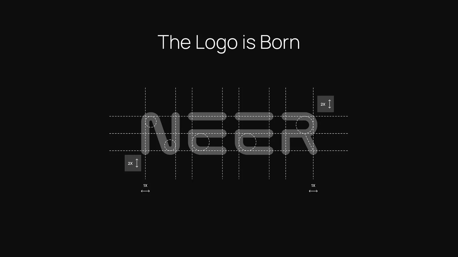
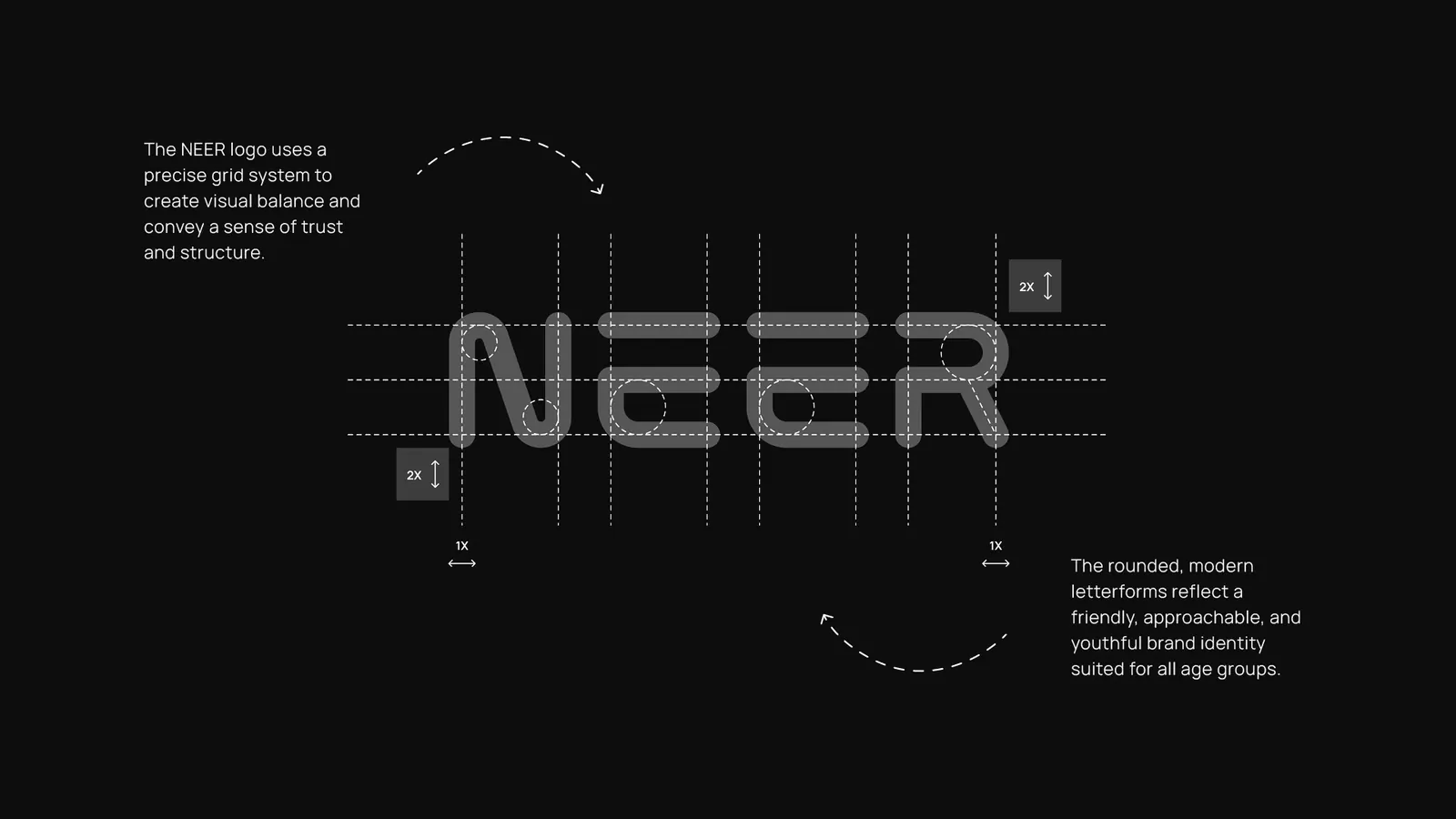
The NEER logo was crafted with a clear purpose: to visually express financial trust through a design that feels friendly, subtly classic and youthful. Rooted in the idea of providing simple, accessible financial solutions like accepting deposits and lending, the identity uses rounded, custom letterforms to convey approachability and trust across every age group. The design is supported by a clean, modular grid system, ensuring clarity and professionalism.
The problem
NEER lacked a cohesive visual identity that truly represented its values of simplicity, trust and inclusiveness, and had no clear, memorable design system.
The solution
A modern, approachable logo built on a precise grid with custom rounded letterforms reflects both structure and warmth. With a vibrant, optimistic palette and clean typography, the new identity positions NEER as a trusted, youthful and inclusive fintech brand ready to serve all.
Logo Variations
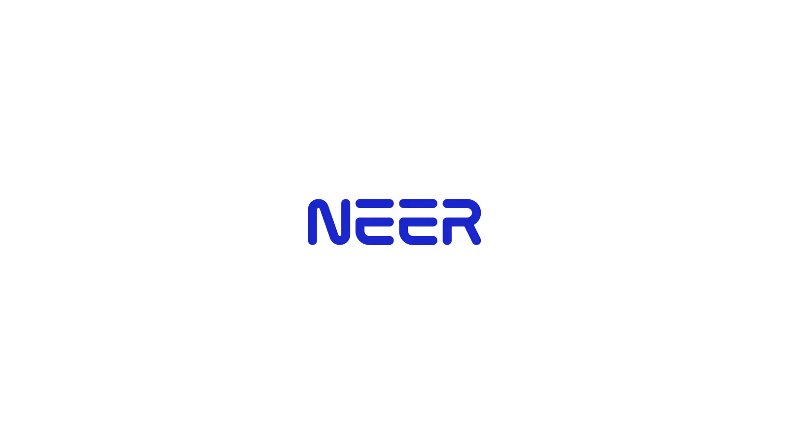
The wordmark holds up on every background the brand uses: the primary Medium Blue on white, solid black and white versions, and reversed versions on the brand’s blue, yellow and red.
Colour Palette & Typography
The colour palette, anchored by bold blue and bright yellow, adds vibrancy and optimism, while complementary shades of red, white and black maintain balance and flexibility. Altogether, the NEER identity reflects a fintech brand built to serve everyone, with simplicity at its core and trust as its foundation.
Manrope, an open-source modern sans-serif by Mikhail Sharanda, carries the brand from the app to signage.
- Medium Blue#1A27C9
- Mikado Yellow#FEC601
- Vermilion#E54842
- Ghost White#F4F4F9
- Night#0D0E0E
- ManropeABCDEFGHIJKLMNOPQRSTUVWXYZ
abcdefghijklmnopqrstuvwxyz
1234567890